Design of a responsive banking app
The landscape of online banking is fiercely competitive, with numerous players vying for attention and market share. Amidst this saturated field, Banc Airgead emerges as a fresh contender, aiming to carve its niche in the area of financial services. Recognising the importance of differentiation and connectivity with the younger demographic, Banc Airgead sought to develop a user interface brimming with personality, tailored to resonate deeply with its target audience.
In a crowded market, Banc Airgead is introducing its banking application, necessitating the development of a responsive design for its launch. Emphasising a vibrant and engaging experience, the application aims to appeal to a younger demographic, requiring it to be distinct and effortlessly intuitive from the outset.
The application should prioritise responsiveness and ease of use across various platforms and devices. Information must be readily digestible and easily locatable for users. Effective navigation is of the utmost importance to ensure a seamless user experience.
To truly connect with the user, three brand principles have been identified. These are;
At the outset, preliminary wireframes were presented for the application. My responsibility entailed expanding upon these wireframes and identifying the best approach to utilise design elements to effectively communicate the information.
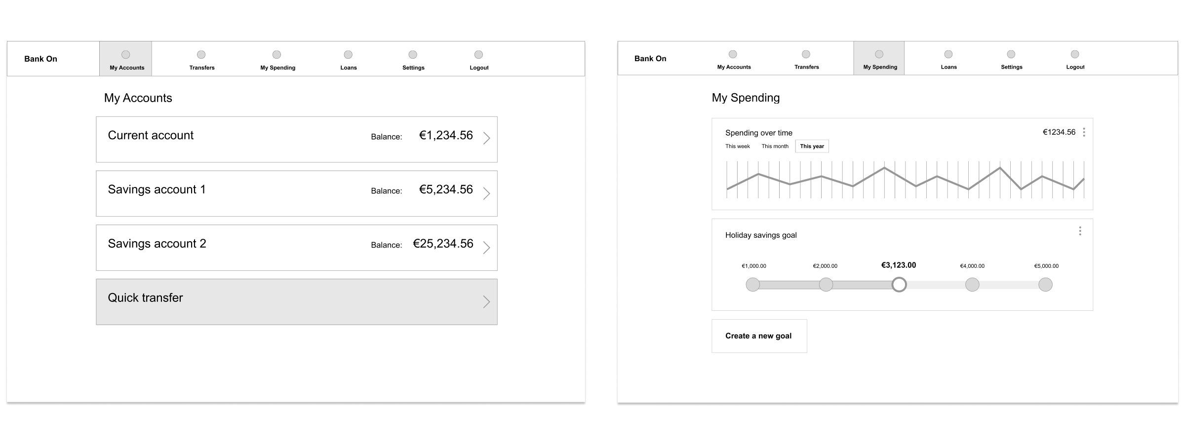
Some of the wireframes provided for the banking application
Research was conducted on market competitors, encompassing materials around interactivity, typography, brand tone, and innovative or unconventional approaches, spanning not only the financial sector but also other relevant industries. This culminated in a virtual moodboard to act as a reference point throughout the project. This included headings such as typography, shape, interactivy and colour.
A comprehensive style guide was created. This included a colour palette, typography, iconography, and a series of UI elements for use across the banking application. The guide centered around the three brand principles of playful, clear and trustworthy. A fun, vibrant colour palette was selected. Libre Baskerville was the headline font of choice, as it adds a level of gravitas to the design, while retaining a friendly feel. Work Sans was used as the body font, it is legible at smaller sizes and has an open, warm style. An icon set was chosen for its adaptability and sense of playfulness.
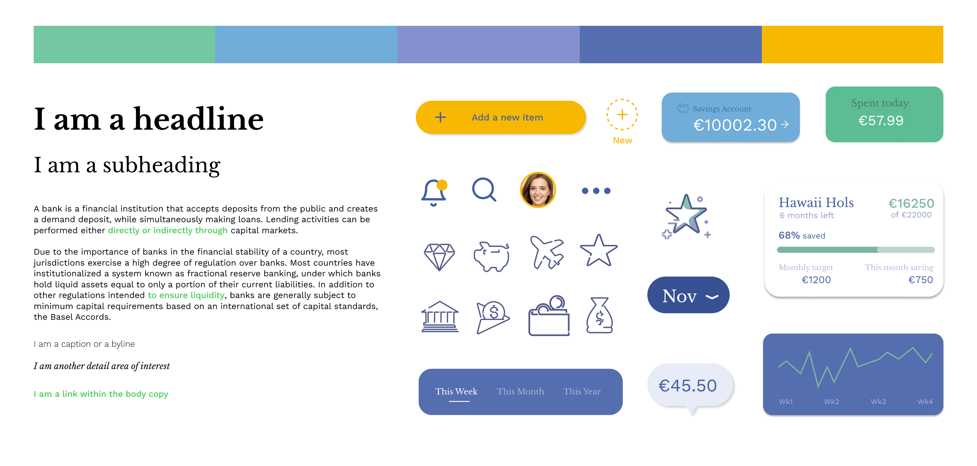
The style guide covers colour, typography, icongraphy and UI elements.
Curved edges are a consistent feature across the entire application, spanning cards, icons, and various other elements, subtly hinting at a gentle and inviting approach. Adding to the atmosphere of playfulness and approachability, a light polka dot pattern is used for the app's background. To prevent overwhelming the user, information is segmented into manageable chunks using cards, ensuring a smooth and digestible user experience. A personalised touch is woven throughout the interface, incorporating the user's name and preferences to foster a sense of connection and individuality.
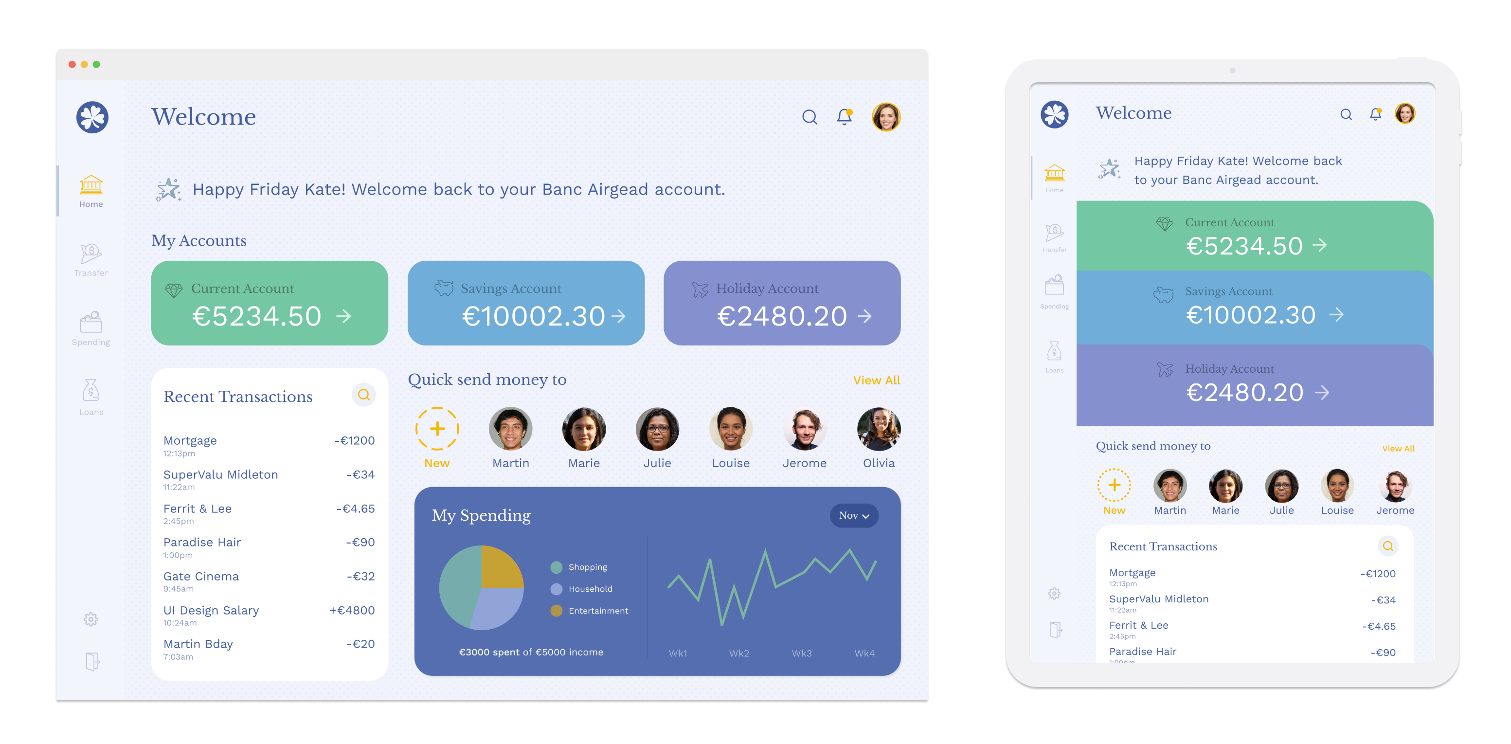
The Bank Airgead welcome page for desktop and tablet
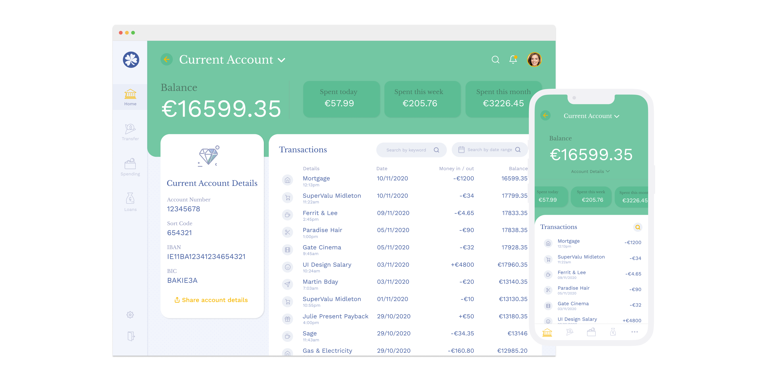
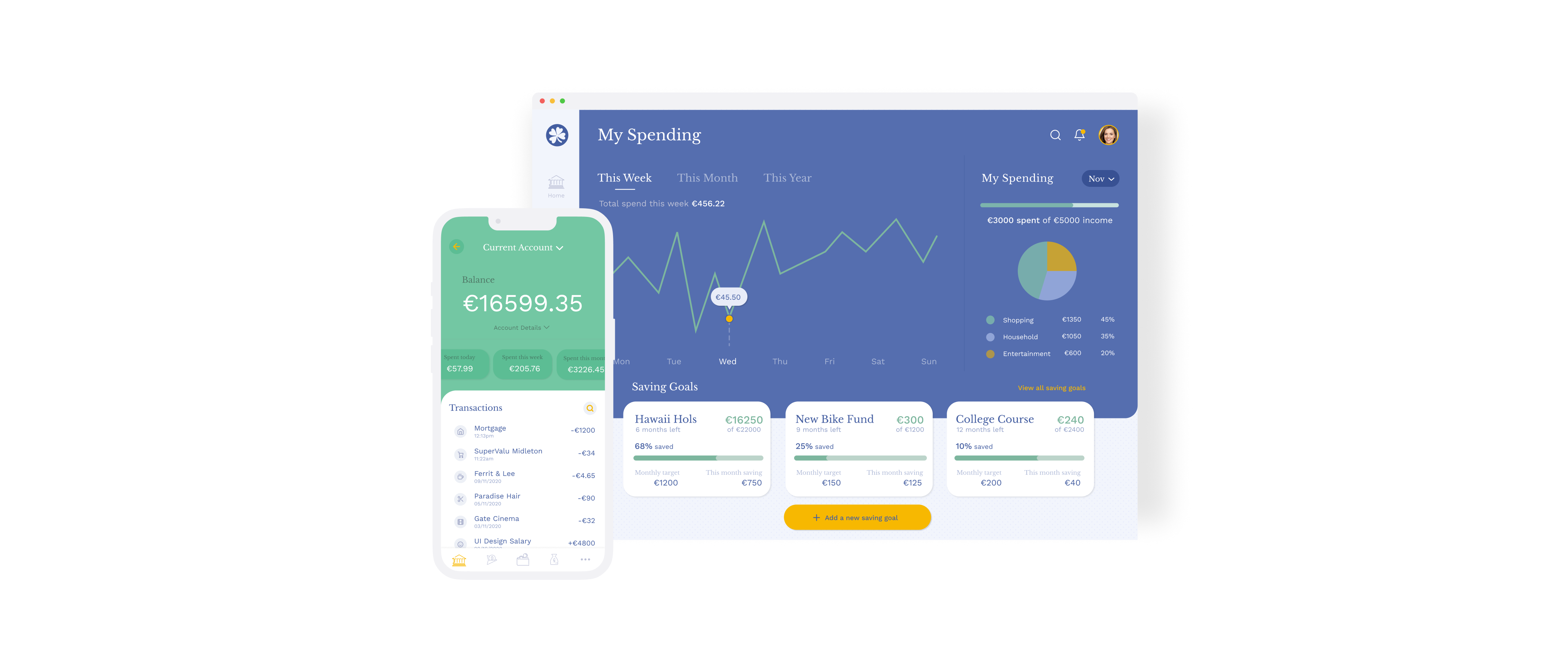
The Current Account screen offers an overview of key spending items and translates to mobile via use of a card system
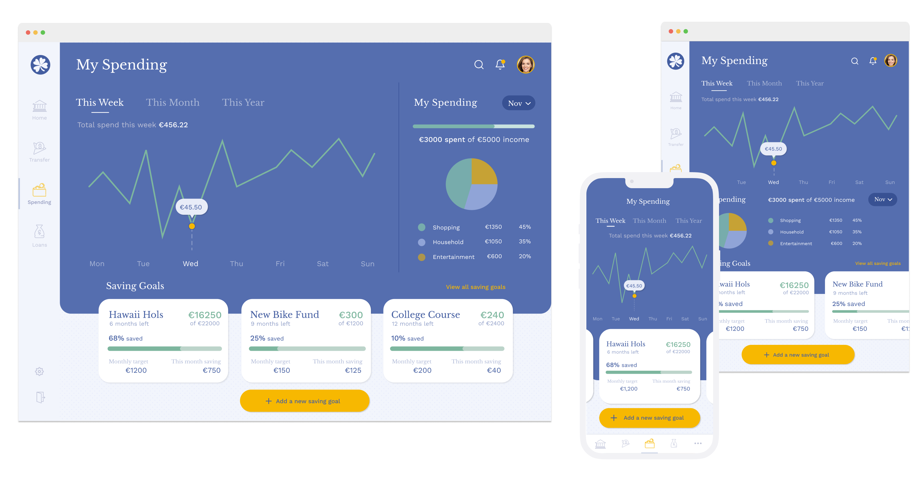
The My Spending section is a visually led area with the option to add spending goals and review spending using various filter options